
amanico
[JLC Moderator]
347051

A confirmation, SJX
The Portuguese is a very nice beast, and seems, as you said, much more appealing than what we saw in the Press files...
I will certainly see it asap in the flesh to make my mind on it, but I really think that I'll appreciate it.
A deception, now, the Flieger...For the same reasons than you, SJX..These greenish indexes are just not for me..I find them ugly..It's ok on the Aquatimer, not on the Flieger...
The other deception is the Portofino, much less appealing in real than in the Press Files pics, and I saw in in real at Geneva...
Maybe the platinum version will give me another view on it?
I'll check...
But there is one I'm sure I will never gon on it, this is the Da Vinci...
Just not at all my taste...
But to each its own...
Thanks a lot to have taken the time to post this topic and your pics, my friend.
Nicolas
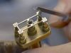
PS: Nice idea to have put the FA Jones movement in them!

Real life photos of the IWC Vintage Collection and some opinions
A confirmation, SJX


Whereas the Portuguese looks great with the black dial


For me, some of the platinum Vintage Collection pieces look better

