
SJX
[Purist]
8540

Real life photos of the IWC Vintage Collection and some opinions
Here are some quick and dirty photos of the IWC Vintage Collection, and some quick and dirty opinions. 
(Images of the Ingenieur are missing, for some reason I couldn't find them in my memory card, I must have accidentally deleted them)
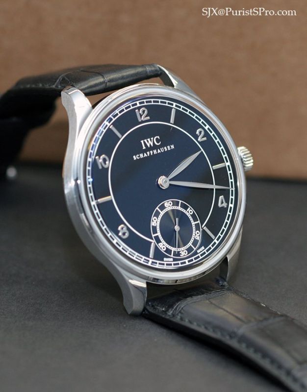
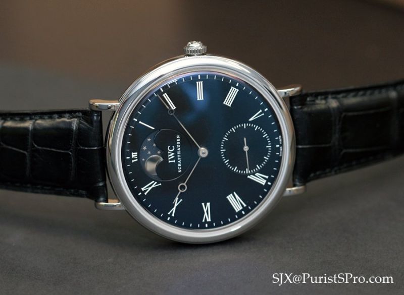
My favourite by far is the Portuguese. It looks a whole lot better in the metal and on the wrist than it does in press kit photos. Despite the straightforward "IWC" logo instead of the old style lettering in italics, the watch is a beauty.


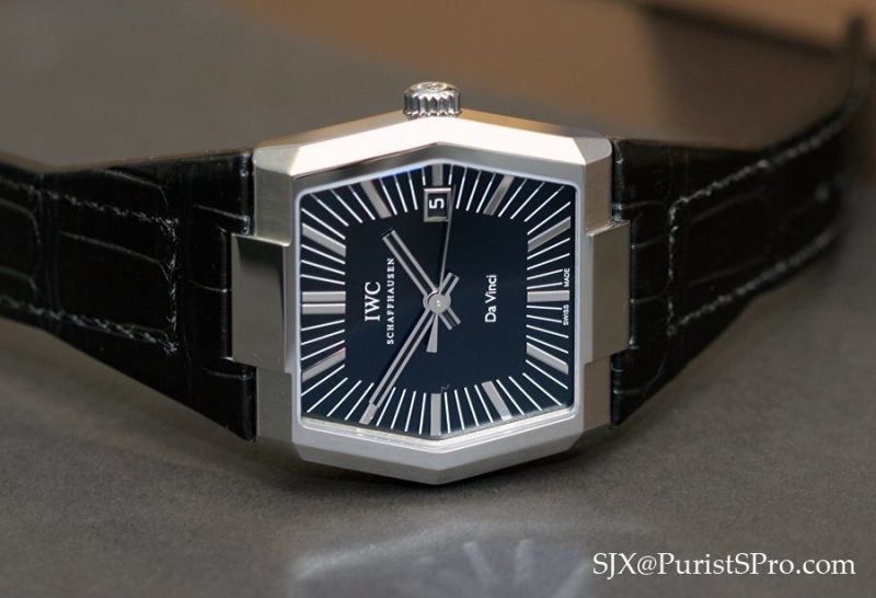
Surprisingly, my other favourite is the Da Vinci. It's cool and funky, and it looks great on the wrist. I initially thought it looked horrid, like a bad flashback to a forgotten era. But the end result is really brilliant. This is one watch that will look equally good on a male or female wrist.

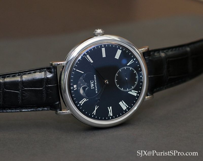
Aside from the Portuguese, the other crowd favourite is the Portofino - I don't like it. It is near impossible to read due to the black dial and shiny hands, and the moon phase disc just doesn't stand out; a moon phase watch should be beautiful but this one is not. Still, it is not an ugly watch.


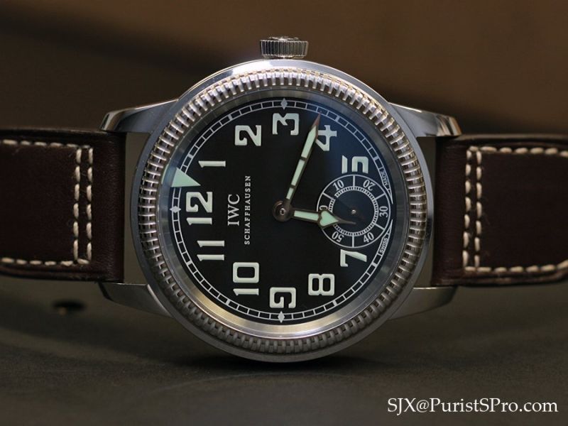
The rest of the vintage series leaves me indifferent. They are well executed but not extraordinary, with the exception of the Flieger which is completely unappealing; the dial, greenish luminous material and case just don't look right.
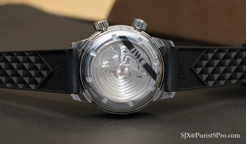
The Aquatimer

The Flieger
The only two I may actually buy are the Portuguese and Da Vinci - IWC did a fantastic job with those two. Bravo!

Many thanks to the great folks at IWC Singapore - Andreas, Connie and Vivian - for the hospitality extended to me today.
- SJX
This message has been edited by SJX on 2008-05-20 09:14:29
Real life photos of the IWC Vintage Collection and some opinions
Here are some quick and dirty photos of the IWC Vintage Collection, and some quick and dirty opinions. (Images of the Ingenieur are missing, for some reason I couldn't find them in my memory card, I must have accidentally deleted them) My favourite by far...


A confirmation, SJX
The Portuguese is a very nice beast, and seems, as you said, much more appealing than what we saw in the Press files... I will certainly see it asap in the flesh to make my mind on it, but I really think that I'll appreciate it. A deception, now, the Flie...


Whereas the Portuguese looks great with the black dial
the Portofino is stunning only with the white dial, which makes it come closest to a pocketwatch worn on the wrist I have ever seen, in the nicest possible way. The other watch I like is the Ingenieur, not despite but due to its generic looks - this is wh...


For me, some of the platinum Vintage Collection pieces look better
than their corresponding steel pieces from Vintage Collection. The Platinum versions all use white dials while the steel versions black dials; and for those wondering, you can click here to see pics of the Platinum pieces. I personally like the below watc...
The huge box of the platinum set is awesome
so try to see the box too if u have a chance. Cheers, Anthony

any credence to a price increase in June
Sorry for hijacking this post. I saw the Vintage line this weekend. Actually I am very interested in the 5001 Portugues Auto. One AD, claims there is a 10-15% price increase in June, but it's not clear if this was a sales tactic or reality. anyone else he...
