
Gary G
3734

Great questions, and all interesting hypotheses
Great OP, and very interesting thread so far!
My guess is that any and all of the root causes set forward by various posters apply to many individuals. For me, the one that really rings true is that the more striking the watch is (in unconventional visible ways), the faster I tire of it. I first found the PuristS in 2004 as I searched for a PP 5015, which I found devastatingly attractive but wore less and less. More recently, i bought a PSM Thalassa sight unseen, and within months determined that the dial was just "too blue." Same thing, by the way, for the UN Maxi Marine chrono with the blue dial, and even for the UN Executive Dual Time -- just too harsh on the eyes after a bit, despite the initial "wow" factor.
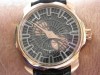
A potential exception (I hope) is the VH Antiqua, which certainly has "wow" and is unusual looking, but is also both horologically significant and just gorgeously made. It also has a visual feature that plays well to my eye, which is the asymmetric layout. As an amateur/hack watch photographer, even I know that there are certain visual layouts that appeal to the eye, and some that do not (rule of thirds, triangles, etc.). Some of these rules seem fairly universal, and others I would suggest are more personal. For me, the idea of asymmetric layout really plays -- so when I peek at my wrist, it makes me happy. The 5015 fit this bill (but was ultimately doomed by its more flamboyant visual cues); I have owned several watches based on the JLC dual time movement with its distinctive PR, date, and second time zone displays, the Antiqua, even the slightly differently sized sub-dials on the VC OS chrono. I'll hazard a guess that if you look at all of your watches, you will find that several of the keepers have similar visual cues of some type.
Best,
Gary G

What determines the longevity of a watch within a collection?

Interesting theory!
Hi Ken!

excellent read

Great article, Ping!
Thank you Daos....

Another superbly written article, Ping.

+1 In complete agreement...
Thanks for your kind words, Patrick.
Hello Nicholas!
For me, the main factor is knowledge...
Another excellent point....

An eloquently written article Ping...
Hi Sam!

Great article. It makes me wonder ...
Hi Nilo...
A watch must endure the owner's changing tastes...

Slow to jump ...
I predict that many who do place their orders prematurely end up regretting...

I hope that we both get our watches someday...
Ha ha...yes but what time?
Hopefully soon...
Wow Patrick....
Always a pleasure...

Thank you.
Very Well Said - Patrick
My warmest wishes to you as well...

Nice post :)
Yes....timeless is key
Great post.

Wow that was a fabulous read!

As taste becomes more focused or sophisticated...
Growing knowledge along with....

very good read
Eh, no worries....

This subject could be the foundation for a . . .
Indeed, quite the foundation.
Hmm...interesting idea!
the ineffable
Indeed art...
My thoughts ...
I couldn't agree more...

Excellent post

Fantastic write up Ping!

Thank you for this eloquent piece
Thank you Ginger for your elegant response.
Great questions, and all interesting hypotheses
Subdials!
Thank you Gary for all your personal examples.

Watch collecting is a difficult hobby because of the points you have
Hi Julian,

This is a great topic and something I have thought
Absolutely agree...
Thank you Anthony!
Dear Ping you hit that nail right on the head..
Hi Mo...yes, it does take time...
I could have written this :)
Hi Mark...


Thought provoking and beautifully written. There is only one watch
A great story indeed...

Unless you buy for investment, it's purely emotional...
yes...it's all about sentimental value...

Fantastic read and thought provoking post!
Thank you!

EITHER True Love OR Inability to sell the darn thing!
That's ok...
Very interestin post

Sometimes it may be the WRIST TIME!
You make such a great point...
I really enjoyed reading this post....

Enjoyed your post very much Ping
LOL....

For sure
Hi Albert...

For me it's all wrist time related.
Hi George...
I could not agree more!
Well thank you for agreeing...
Watches with significance...
Interesting and perceptive post
Thank you for your two bits....

Thank you Ping for this fantastic & thought provoking post...
Thank you Abel...
This is not a watch question!
Hi Robert...

Interesting Thoughts